Recently I found this blog, What I wore, on pinterest the other day. It’s actually a tumblr blog, but it doesn’t look like it. I love how this blog is laid out. 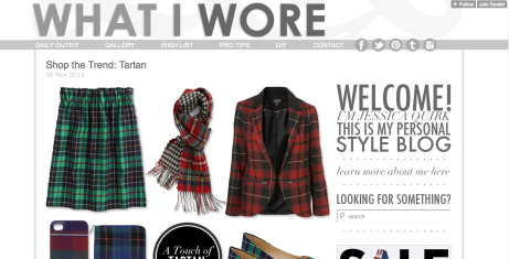
As you see from the main page, its mostly grey, except the most recent update (which is in full color). This is a great way to get the user’s attention on what is the most important, the recent entry. In my previous post, I spoke how tech crunch was confusing because everything was the same color. This site does it wonderfully. With its simple, classy design, it definitely fits the content, style. Also, it follows the heuristic, Aesthetic and minimalist design. While some might think a user might get confused, the navigation changes to almost black when you hover over it. This jumps out on the page which then brings the attention to the selections.
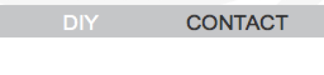
Above is a screen shot of what the dark hover color looks like. This site is sooo simple, but still gets across the point and presents a solid navigation. When on the main page, you know exactly where you are “Jessica’s Style Blog.” However, I did notice that the search bar is in a very unconventional place, in the center of the page to the right. While this might confuse a user, it works and actually seems smart. Some might argue its not, but with the forward thinking of the content and style, it only makes sense to design something that is forward thinking and almost unconventional. Love Love Love this site!

Thanks for getting me addicted to another site… blog, technically
An interesting blog.